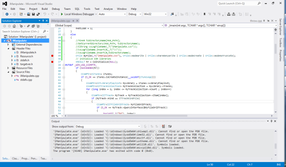
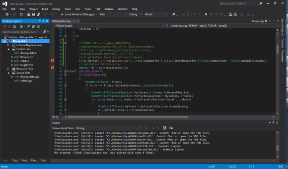
I really hate the new flat style that Microsoft is pushing. They’ve gone so far as to using icons with fewer colors. Colors help differentiate things on the screen, so reducing the colors makes it harder to find what you are looking for, especially if you know what it’s looked like in the past. Things may be worse on my laptop because it seems to have lower contrast in its screen colors, but I never had significant problems with VS2010.
I already got rid of the default all uppercase menus in Visual Studio 2012, following instructions found at http://blogs.msdn.com/b/zainnab/archive/2012/06/14/turn-off-the-uppercase-menu-in-visual-studio-2012.aspx. I’m amazed that this feature is not modifiable in the interface, but requires manually modifying the registry.
The new visual studio allow you to pick whether it’s dark or light, which interestingly seems to change the fonts used as well, because a different number of lines of code are visible on the screen.
Below I’ve included three screen shots from my laptop with the same basic project loaded, First in VS2010, then in VS2012 with the color set to Light, and then in VS2012 with the color set to Dark.


